BY: KARA ISOZAKI & MAEGHAN JERRY
The summer edition of Museum Mondays will be a three-part series focusing on the convergence of libraries, archives, and museums (LAMs). Convergence has been a popular topic in Canada since the early 2000s. While the three fields have somewhat different histories, values, and methods, LAM institutions are all involved in collecting and preserving materials for the benefit and use of the public. Kara and Maeghan will bring their perspective as students of both Museum Studies and Archives & Records Management to publicly visible areas of overlap and interaction between LAMs.
One of the most visible overlaps between libraries, archives, and museums is the use of exhibitions to display and promote library and archival holdings. There are numerous examples of archives and libraries in Toronto that put on regular exhibitions, and we chose to visit three to check out how different institutions were exhibiting their holdings: Vice & Virtue at the Toronto Reference Library (TRL), Struggle & Story: Canada in Print at the Thomas Fisher Rare Book Library, and From Streets to Playgrounds: Representing Children in Early 20th Century Toronto at the City of Toronto Archives.
 |
| Gallery spaces (left to right): Toronto Reference Library, Thomas Fisher Rare Book Library, and City of Toronto Archives. Photo by Kara Isozaki. |
Maeghan: All of these exhibitions featured primarily print materials, and yet they all made things really dynamic.
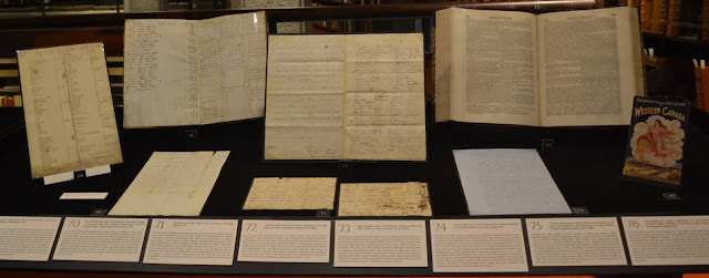
Kara: Yeah, all three institutions had objects on the walls and in cases, propped up or laying flat. The TRL and Archives mounted reproductions by sticking them directly to the walls and nailing them on like public notices.
M: Those two institutions were really creative in the layouts of the wall mounts, mixing different sizes to create visual interest. Also, the Archives showed rotating photographs on screens which added movement to the exhibition.
K: I think that using reproductions made it easier to create the diverse wall layouts. Fisher’s exhibition was different because nearly all the objects on display were originals. I wonder if they were able to do that because the display area is light controlled.
M: Yeah, I think the whole building is climate controlled as well because part of the collection is housed in open shelving. Fisher also brought in artifacts to add to their display cases, which we didn’t really see in the other exhibitions.
| Wall display at the City of Toronto Archives. Photo by Kara Isozaki. |
K: I noticed each exhibition took a different interpretive approach.
M: Yeah, it ended up being a spectrum, where TRL had what would be the most museum-like interpretation and Fisher was more like an essay in exhibition form, and then the Archives fell in between.
M: Yeah, it ended up being a spectrum, where TRL had what would be the most museum-like interpretation and Fisher was more like an essay in exhibition form, and then the Archives fell in between.
K: I found the TRL was more accessible because it had a clear theme with subsections. They used a mix of section panels, object labels, and infographics to give you multiple ways to access the information.
M: The Archives was pretty good in terms of having clear sections, but it lacked an overall story or theme. It seemed like the sections were focused on the records and creators represented in their collection rather than on the topic presented in the title.
K: Yeah, that might be because the content is based on the results of a research project and what information the Archives has about the records. The Archives might know more about the records creators than the people affected by the creation of playgrounds.
M: That’s very true, but would a visitor who doesn’t have a background in archival work know and recognize that? It wasn’t a bad exhibit overall, it was just that it seemed to lack a core theme. They should have named it something different. That might have provided a better connection between the sections.
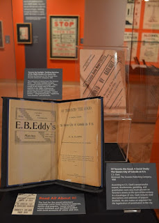
K: The Fisher, on the other hand, took a really different approach. Their exhibition was way more text-heavy than the other two. They chose to present their information through object labels instead of section panels. It diverged the most from the museum interpretive techniques we learned.
M: The amount of information and text format felt more like an exhibition catalogue than a label. The catalogue was actually placed in a more prominent location than the introductory panel.
 |
| Case display with text-heavy labels at the Fisher Rare Book Library. Photo by Kara Isozaki. |
K: I suspect the different interpretive approaches reflect the institutions’ different ideas about their audiences. With the Fisher, I think they’re writing for a more academic audience since they’re part of the university.
M: I agree. I imagine that they do get tourists, but they probably come to see the grandeur of the space itself, and the exhibition just acts as an example of what’s inside all the books on the shelves.
K: The TRL probably has the most diverse audience, since the building has been designed to be a community space, with a comic book store and coffee shop also on the first floor. The exhibition definitely felt like it was designed for an audience of the general public. Everything was really accessible.
M: The Archives was also aimed at the general public, but I think most of the visitors are people who are coming to the archive for other purposes, like research.
 |
| Case display at Toronto Reference Library. Photo by Kara Isozaki. |
K: So what did we learn?
M: It seems to me that the institutions are picking up on display methods faster than they’re picking up on interpretive methods. We saw a lot of really great material displayed in creative and engaging ways, but the institutions differed in the ways that they presented associated information.
K: That’s true, but we are judging these exhibitions from a museological perspective, which comes with a lot of assumptions and history that these other institutions may not operate on.
M: But I think it’s fair to do that because all of the institutions we visited advertised their exhibitions as exhibitions with themes and in dedicated gallery areas. We didn’t just stumble across a “recent acquisitions” shelf.
K: Either way, I thought they were effective overall. We enjoyed visiting each of them and I feel like I learned something from each one.
Have you visited these exhibitions or others in libraries or archives? What did you think? Let us know in the comments!


No comments:
Post a Comment
Note: only a member of this blog may post a comment.